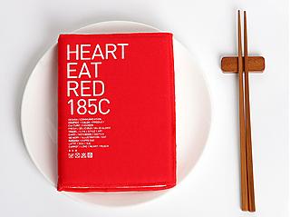
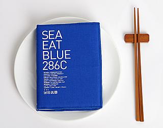
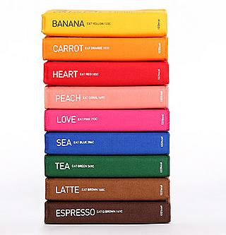
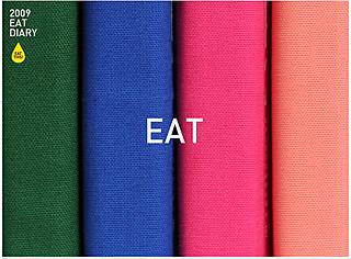
Eat is the name of this collection of chromatic date books. They come in 9 colors, each of which corresponds to a color in the Pantone color-matching system.
Valorado por 1 usuarios
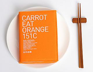
Carrot Orange Diary "Orange 151C"
Pantone is the most widely used color-matching system in graphic arts and is recognized throughout the world. Anyone who’s used Photoshop has probably noticed the infinite color palette Pantone offers. Which one should I choose? There are too many! Even so, it’s still the system of choice for professionals who work with colors, such as graphic designers, artists and painters. The advantage of this system is that each of the samples has a code and once you choose a sample you can recreate the exact shade of color.
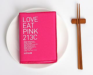
Pantone codes are so much a part of our lives that even the flags of certain countries such as Canada, South Korea, or Scotland are defined by Pantone codes. London’s red buses have their own code, number 485, which has been reproduced in Pantone’s famous W2 mugs. In Pantone’s world, even love has a code! It’s 213C, which is none other than an explosive shade of pink.
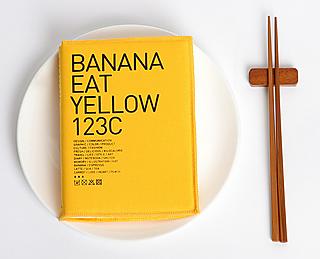
The korean agency that created the Eat notebook collection, 122kcal Design Studio, has used provocative colors to dye their diaries’ covers: banana yellow, sea blue, tea green, or latte brown. Ready to eat! The result are monochromatic diaries that anyone who works with classic Pantone colors on a daily basis will love.
Three interesting facts about Pantone:
The list of chromatic numbers is the company’s own intellectual property and the company must authorize use of this list.
The Pantone company is also involved in the world of fashion. The company issues a report each year proposing colors for each season and they make a list of which designers have used their colors. You can take a look at the "Spring 2009" report here.
You can buy the Pantone shoulder bag on Curiosite. Its shade of green is color number 18-5633TPX.